Challenge:
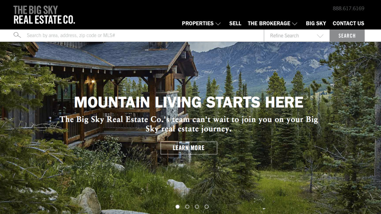
How can we design a real estate experience as beautiful as the place it represents?
Outcome:
The team at Neoscape and I worked closely through an iterative prototyping process, in order to find that balance between imagery and information.
The resulting site resists the clutter common to many real estate experiences, and just "gets out of the way" and lets the photography speak for itself.
Project Details
Client & Collaborator: Neoscape
Links: BigSky.com
Platforms: Web, Mobile
Categories: UX Design


